Add Linked Polygon Layer
1. Link point table with polygon table
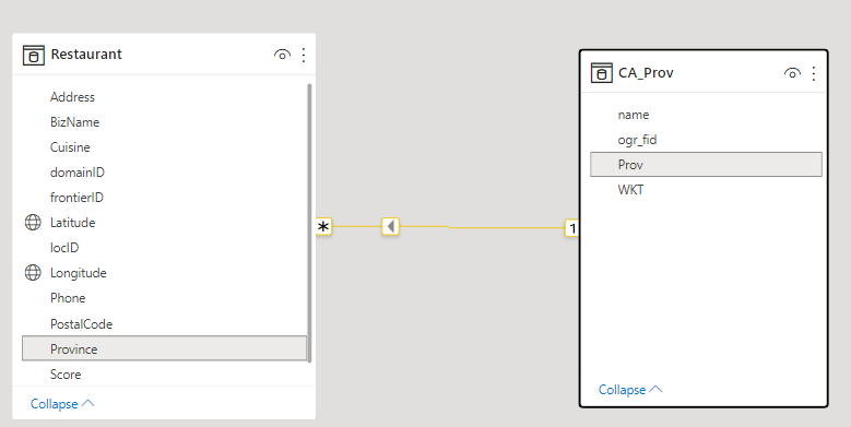
Add 2 tables to Power BI data model. One table contains geographic coordinates: Longitude and Latitude;
another table contains polygon data in WKT (Well-Known Text) format.
Link 2 tables by common field as below:
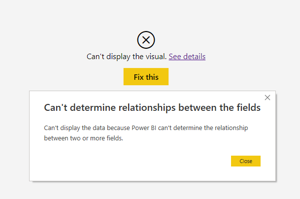
If these 2 tables are not related, an error will be shown as below:
The visual will verify the validity of WKT objects. If some WKT objects are invalid, the warning message will be shown in the bottom of the visual.
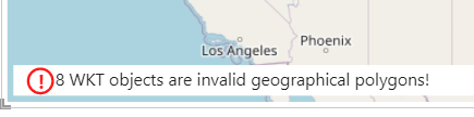
You need to find why they are invalid, and fix them. One reason I found was that WKT string was truncated to 32766 characters when loading from csv file.
Reducing number of points in a polygon will avoid the problem and improve performance.
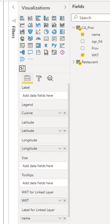
2. Add WKT data to the TMap Visual
Drag WKT data from Data Fields pane to the bucket "WKT for Linked Layer" shown as below:
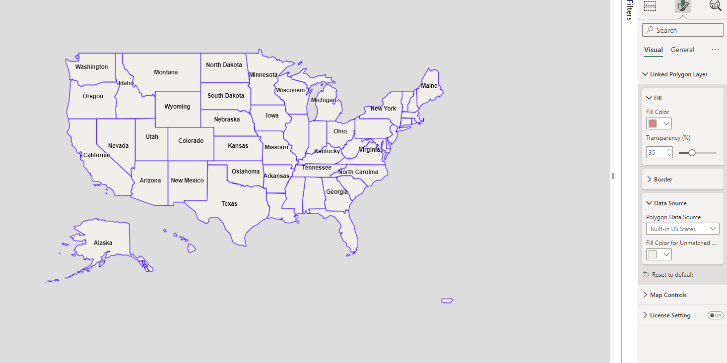
3. Add built-in polygon layer
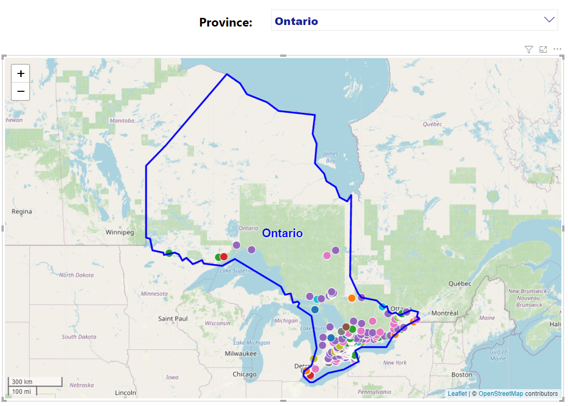
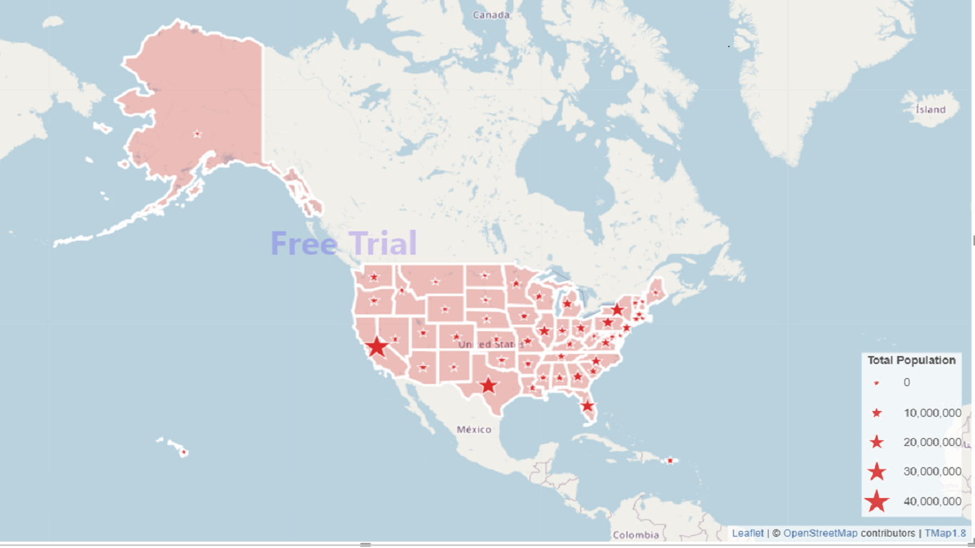
Without WKT data, you can add built-in polygon layer from the section of "Linked Polygon Layer" of the format pane. The following picture shows an example for adding US State boundaries to the TMap Visual. The name of US States will be shown on the map as keys for linking with business datasets in data model. Zooming-in the map in the visual will make all names visible.
4. Link datasets with built-in polygon layer
From the section 3, you know which column is keys for linking built-in polygon layer. Drag Key column from Data Fields pane to the bucket "WKT/Key for Linked Layer" shown as below:
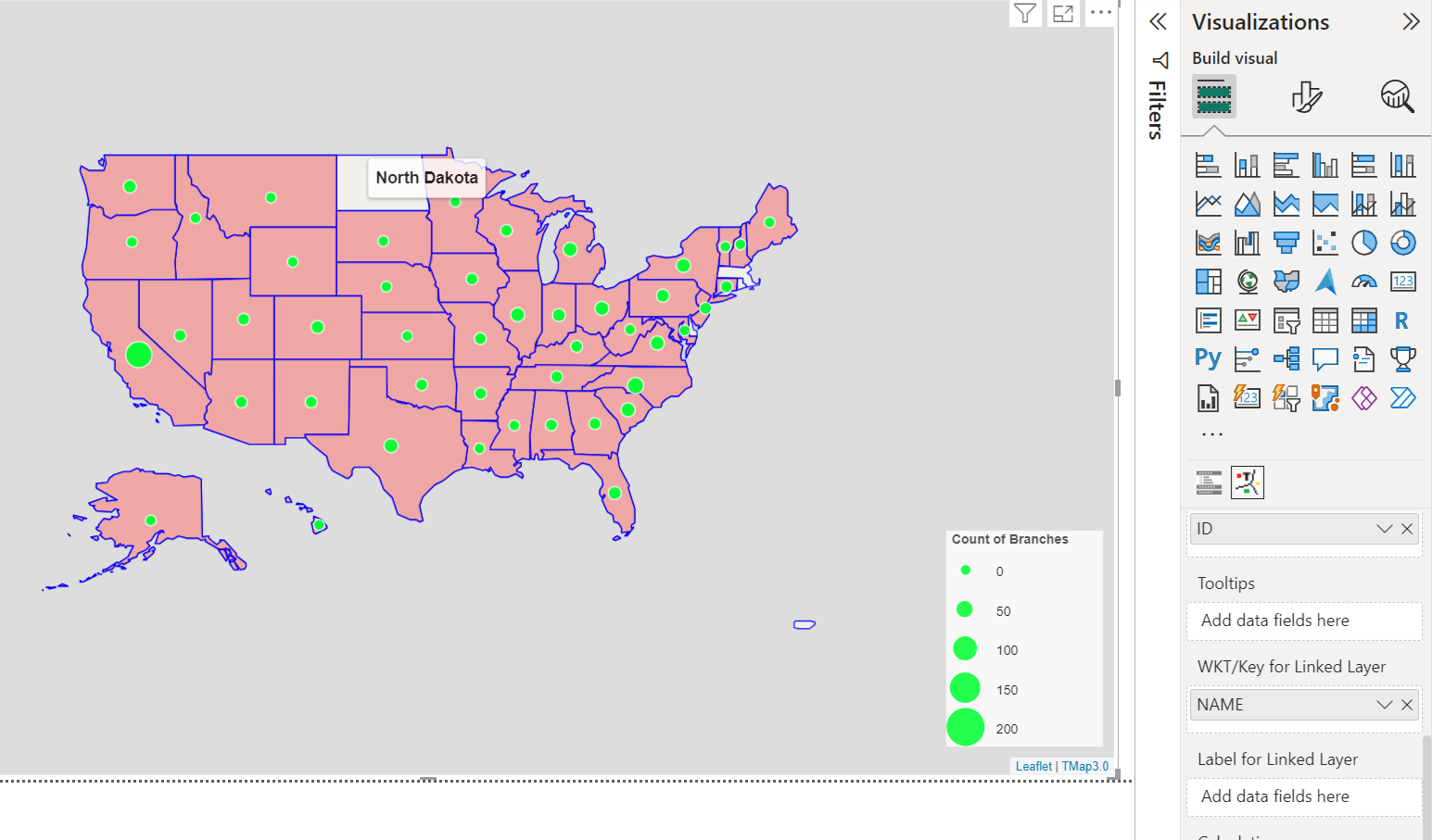
From the above map, you can find one state doesn't match. There are two possibilities for unmatching: one is no data in dataview for this state; another is that the name between the dataset and built-in layer is different. Hovering over the polygon in white color will show the name in built-in layer. If there are different names, you need to change the name in the business dataset to link with built-in layer.
After linking built-in polygon layer with business data in data model, you can start to make thematic maps such as choropleth map, symbol choropleth map, chart choropleth map and drilldown maps.
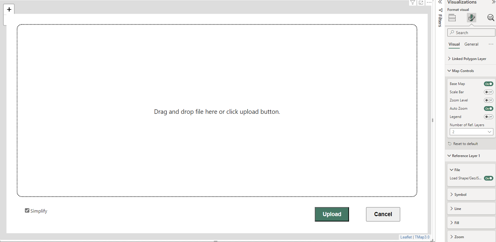
5. Upload shape/GeoJSON file
You can upload shape/GeoJSON file from the section of "Linked Polygon Layer" of the format pane. When you change polygon data source from built-in layers or WKT in Data Model to Upload Shape/GeoJSON File, the following file drop-in and upload window will be shown.
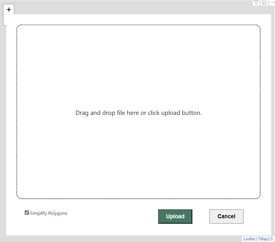
From the above window, you can drag and drop shape/geojson file or click "upload" button to upload the file to TMap. For the best performance, these uploaded polygons will be simplified. If you care about data accurancy of these polygons more than the performance, please uncheck the checkbox "Simplify Polygons". The geographic coordinate system for Shape/GeoJSON file should be WGS 84.
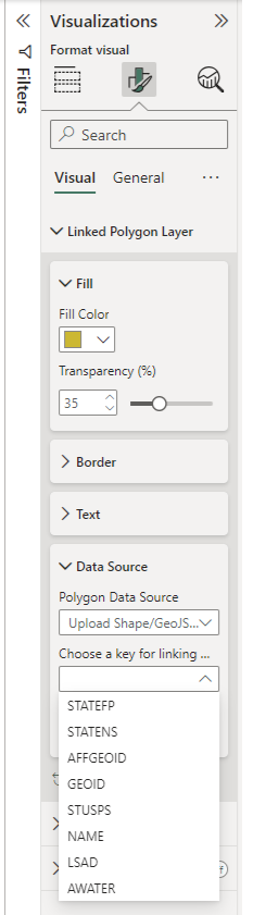
6. Link dataset with uploaded shape/GeoJSON layer
After uploading shape/GeoJSON file, you need to link these uploaded polygons to business datasets for making thematic maps. By choosing a key from the dropdown box in the "Data Source" group of the "Linked Polygon Layer" card of the format pane (see below), then draging a column from Data Fields pane to the bucket "WKT/Key for Linked Layer", the link will be completed.
There are two possibilities for unmatching: one is no business data in dataview for this polygon; another is that the key value between the dataset and uploaded shape/GeoJSON layer is different. Hovering over the polygon in unmatched color will show the key value for shape/GeoJSON layer. If they are different values, you need to change the key value in the business dataset or in the shape/GeoJSON file.
7. Select one or more polygons to show on the map
Select an item from the dropdown list and the marker layer and polygon layer will be shown as below:
Create Thematic Maps
1. Proportional Symbol Map
Drag a data column with numeric data type to the "Size" bucket in the build visual pane, add "Latitude", "Longitude" and/or WKT data to the TMap visual, and choose the symbol type as "star" in the format pane, a proportional symbol map will be created as below:
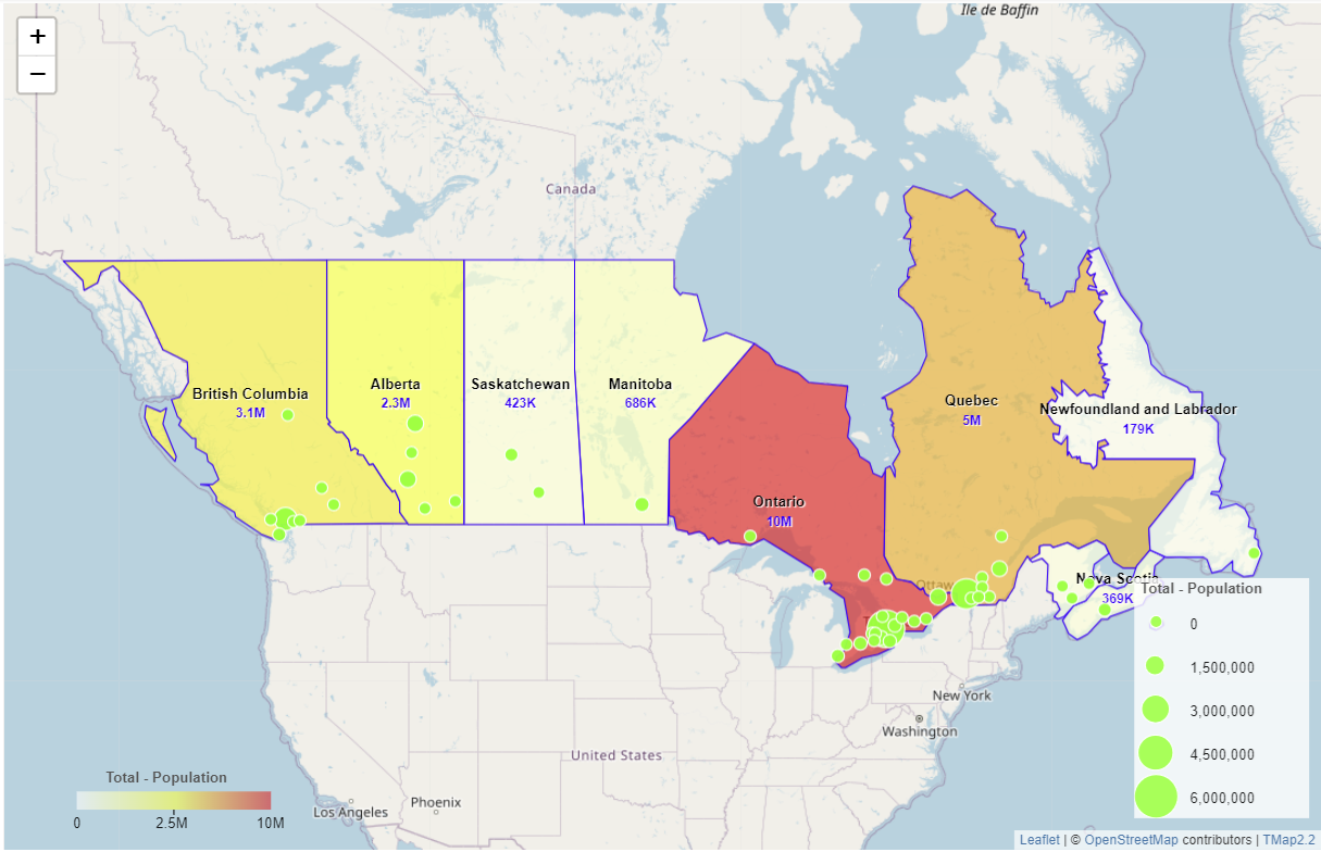
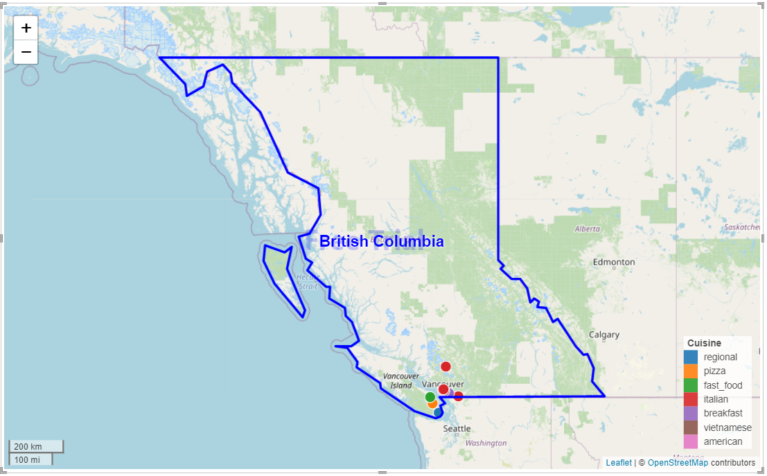
You can change symbol type, color, size and transparency in the "Symbol" section of the format pane. You can bind symbol type to a field by conditional formatting to show different type of data in 6 symbol types (circle, square, triangle, hexagon, star, diamond) provided by TMap. If a field value is not in the list of the 6 symbol types, symbol will be shown as pushpin. The following is an example map showing different proportional symbols in Canada's provinces.

2. Pie Chart Symbol Map
Drag multiple data columns with numeric data type to the "Size" bucket in the build visual pane, add "Latitude", "Longitude" and/or WKT data to the TMap visual, a pie chart symbol map will be created as below:

You can adjust pie chart size and transparency in the "Symbol" section of the format pane.
3. Bar Chart Symbol Map
Drag multiple data columns with numeric data type to the "Size" bucket in the build visual pane, add "Latitude", "Longitude" and/or WKT data to the TMap visual, and change the chart type as "Bar Chart" in the "Symbol" section of the format pane, a bar chart symbol map will be created as below:
You can adjust bar chart size and transparency in the "Symbol" section of the format pane. You can turn on/off "Values - Y Axis" in the format pane to show values in Y axis.
4. Donut Chart Symbol Map
Drag multiple data columns with numeric data type to the "Size" bucket in the build visual pane, add "Latitude", "Longitude" and/or WKT data to the TMap visual, and change the chart type as "Donut Chart" in the "Symbol" section of the format pane, a donut chart symbol map will be created as below:
Total amount will be shown in the inner circle of donut chart if it fit in. You can adjust donut chart size and turn on "Same Size" in the format pane to show all these labels for total amount.
5. Rose Chart Symbol Map
Drag multiple data columns with numeric data type to the "Size" bucket in the build visual pane, add "Latitude", "Longitude" and/or WKT data to the TMap visual, and change the chart type as "Rose Chart" in the "Symbol" section of the format pane, a rose chart symbol map will be created as below:
You can adjust rose chart size and trun on "Same Size" in the format pane to show all rose charts in the same size.
6. Nightingale Rose Chart Map
Drag multiple data columns with numeric data type to the "Size" bucket and one non-numeric column to the "Legend" bucket in the build visual pane, add "Latitude", "Longitude" and/or WKT data to the TMap visual, and change the chart type as "Nightingale Rose Chart" in the "Symbol" section of the format pane, a nightingale rose chart map will be created as below. If the type of the column in the bucket "Legend" is numeric, please change it as text in the Data view in Power BI Desktop.
You can adjust nightingale rose chart size and trun on "Same Size" in the format pane to show all rose charts in the same size..
7. Stacked Bar Chart Symbol Map
Drag multiple data columns with numeric data type to the "Size" bucket and one non-numeric column to the "Legend" bucket in the build visual pane, add "Latitude", "Longitude" and/or WKT data to the TMap visual, a stacked bar chart symbol map will be created as below. If the type of the column in the bucket "Legend" is numeric, please change it as text in the Data view in Power BI Desktop.
You can adjust stacked bar chart size and transparency in the "Symbol" section of the format pane. You can turn on/off "Values - Y Axis" in the format pane to show values in Y axis.
8. Graduated Color Map
Drag a data column with numeric data type to the "Legend" bucket in the build visual pane, add "Latitude", "Longitude" and/or WKT data to the TMap visual, a graduated color map will be created as below:
You can adjust symbol color, size and transparency in the "Symbol" section of the format pane.
9. Unclassed Choropleth Map
Drag a data column with numeric data type to the "Legend" bucket in the build visual pane, add a polygon layer by using WKT data in data model or built-in boundary data inside the visual or uploaded shape/geojson file to the TMap visual, and leave the fields "Latitude" and "Longitude" empty, a unclassed choropleth map will be created.
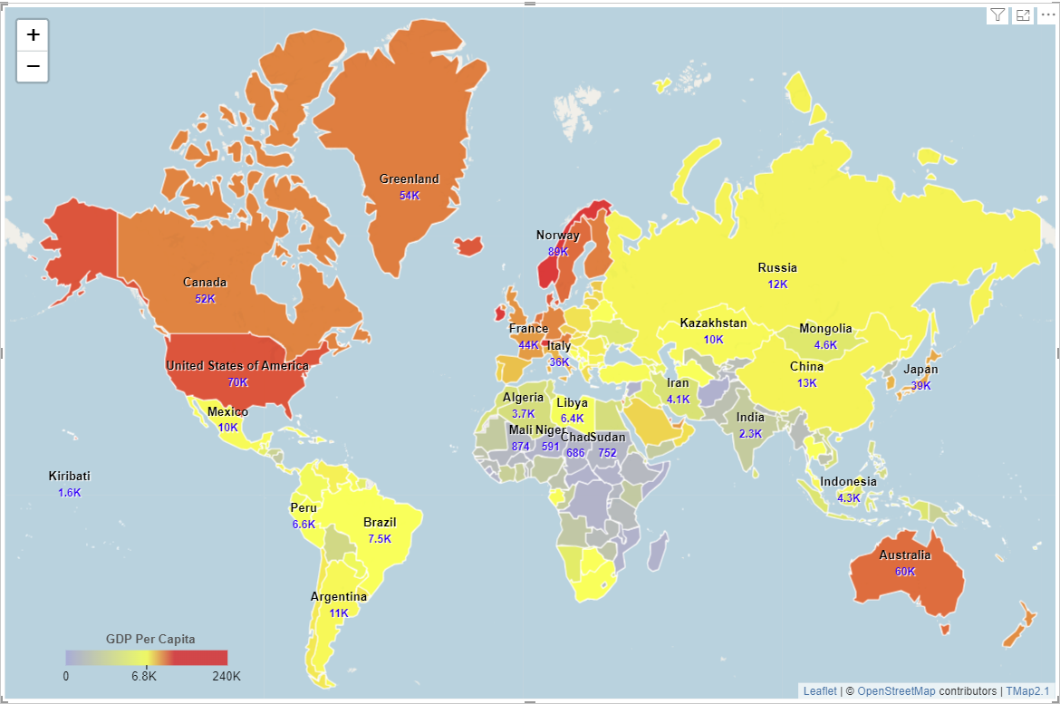
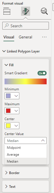
You can turn off or turn on "smart gradient" in the format pane to match 2 colors or 3 colors with data values. In order to make insightful unclassed choropleth map, you may need to turn on "smart gradient" in the format pane below, choose which center values (Midpoint of the range, Average value or Median) to match center color.
Please aggregate (Sum, Average, Count, etc.) the quantity in the the bucket "Legend". Otherwise the polygon will be colored based on first quantity if there are many quantity data in one polygon.
10. Classed Choropleth Map
You can make classed choropleth map by classifying data using DAX expression like below to create a new column:
GDP Per Capita Class = SWITCH (
TRUE,
GDP[GDP Per Capita] > 40000, ">40K",
GDP[GDP Per Capita] > 20000, "20K-40K",
GDP[GDP Per Capita] > 10000, "10K-20K",
GDP[GDP Per Capita] > 5000, "5K-10K",
"0-5K"
)
Then drag the new column to the "Legend" bucket in the build visual pane, add a polygon layer by using WKT data in data model or built-in boundary data inside the visual or uploaded shape/geojson file to the TMap visual, and leave the fields "Latitude" and "Longitude" empty, a classed choropleth map will be created as below:
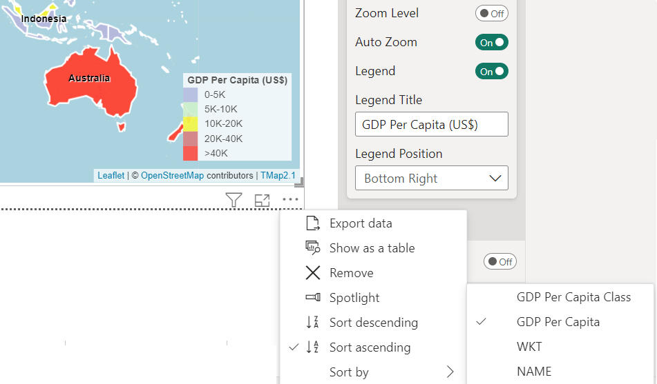
The colors of classes can be changed in the "Linked Polygon Layer" section of the format pane if number of class is less than or equal to 10. When all classes are shown on the map, you can lock the customized colors by turning on "fill volor locked" in the format pane, then legend colors will keep same while you filter data; otherwise, legend colors will change as data changes.
You can also sort the legend items by sorting the data with numeric column shown as below. This is a specific feature for TMap to show legend items in an order from small to big for classed choropleth map.
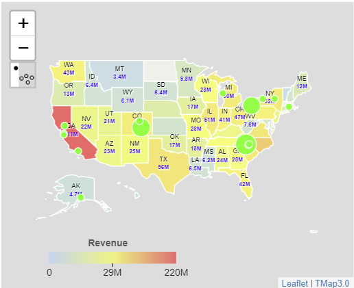
11. Symbol Choropleth Map
Firstly, make a proportional symbol map; secondly drag a data column with numeric data type to the "Legend" bucket in the build visual pane; thirdly add a polygon layer by using WKT data in data model or built-in boundary data inside the visual or uploaded shape/geojson file; fourthly add label for the linked polygon layer; finally change Legend Layer as "Polygon Layer" in the "Map Controls" section of the format pane, a symbol choropleth map will be created as below.
Based on your business needs, you can change aggregate type as Sum, Average, Median in the "Legend" bucket in the build visual pane to make different choropleth map.
12. Chart Choropleth Map
Make a chart map first, then drag a data column with numeric data type to the "Legend" bucket in the build visual pane, add a polygon layer by using WKT data in data model or built-in boundary data inside the visual or uploaded shape/geojson file to the TMap visual, a chart choropleth map will be created as below.
Based on your business needs, you can change aggregate type as Sum, Average, Median in the "Legend" bucket in the build visual pane to make different choropleth map.
13. Grid-based Heat Map
Before creating a grid layer, you need to add a marker layer or a reference layer to the map first. If you want to clip these grids by boundary data, you need to add a linked plygon layer or a reference layer with polygon data. After these layers are ready, you can toggle "Gererate Grid Data" in the Grid Layer section of the format pane, then the following dialog box will be shown on the map.
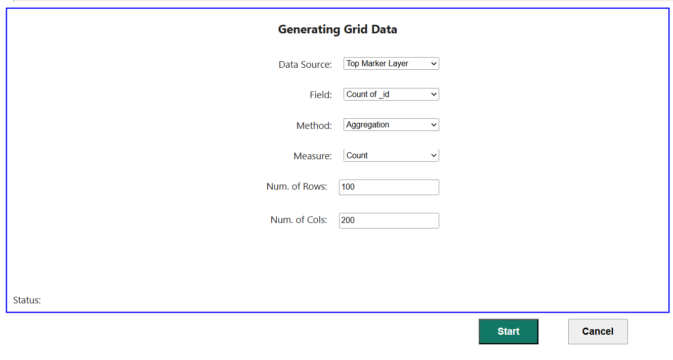
On the dialogbox above, choose Data Dource, Data Field and Method, and set how many rows and columns for the grid layer. If you choose to generate grid data by aggregation, you also need to choose measure (Count, Sum, Average, Minimum, Maximum, Median) for it. If you choose to generate grid data by interpolation (IDW or Kriging), you can set up spatial extent and search radius for interpolation. After all these parameters are set up, click the button "Start" to generate grid data.
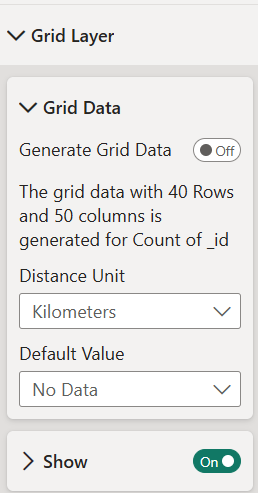
After completing the generation of grid data, metadata for the grid layer will be shown on the Grid Layer section of the format pane like below.
Now you can change colors for gradient, set up transparency for fill, filter out grids with lower value and decide whether the grid layer will be clipped by the linked polygon layer or not. If you toggle the "show" for the slice under the Grid Layer section of the format pane, a grid-based heat map will be shown like below.
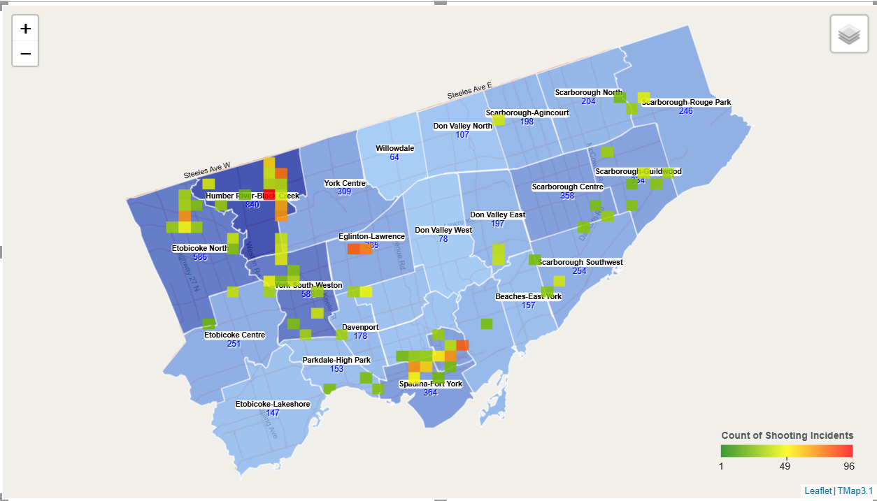
14. Contour-based Heat Map
In order to create a contour layer, you need to add a marker layer to the map first. After that, if you turn on the "Contour Layer" card in the format pane, TMap will create a contour layer using kernel density estimation. A contour-based heat map for Toronto shooting incidents during 2004-2025 is shown as below.
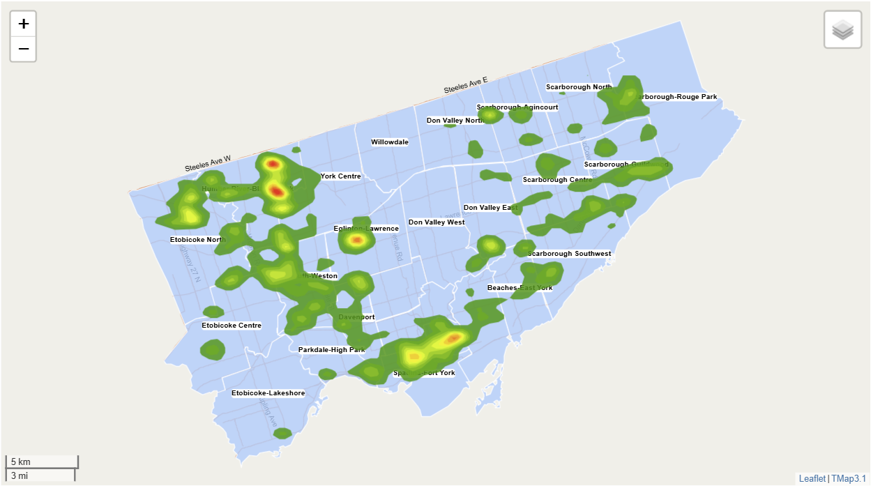
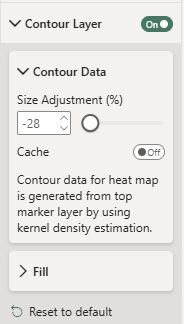
The key parameter for kernel density estimation is the kernel bandwidth (standard deviation), which decides the spatial extent impacted by each data point. TMap will calculate the initial value automatically, then you can adjust it on the "Contour Layer" section of the format pane like below.
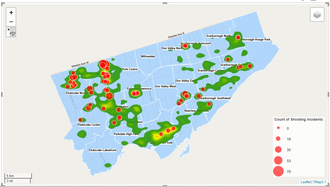
How to adjust the kernel bandwidth to increase or reduce the heat surface size depends on your business data and professional judgement. A large bandwidth creates a smoother, wider density estimate that may underfit to data points, while a small bandwidth results in a jagged, narrow estimate that overfits to data points. My suggestion is to overlay the proportal symbol layer with contour layer, then conduct outlier analysis, adjust it to find the best size. The following is a map to show top marker layer with upper outliers overlaid with contour layer for Toronto shooting incidents during 2004-2025.
We don't provide "Legend" for contour-based heat map. The reasons are as follows: firstly the values in it only have relative meaning to show where is high density and where is low density, which don't like a grid-based heat map whose values have real meaning i.e. the number of occurances in a grid; secondly the values change as the bandwidth changes, in which a small bandwidth will produce a higher maximum value for the surface; Finally we don't want to put you, BI developer, in a difficult situation to explain what the numbers (probability density) in the Legend mean, what you need to explain is just where are hot spots.
Show Legend
Set "Legend" in the format pane as on, the legend can be shown on the map as below
You can change the legend title and position in the "Map Controls" section of the format pane.
Add Labels
1. Add Labels for Top Symbol Layer
If top symbol layer on the map, drag a data field to the "Label" bucket in the build visual pane, then labels will be shown on the map as below:
You can change label color, text size, font and background in the format pane.
In order to avoid overlaping of labels on the map, you can set up visible zoom range in the format pane.
A map control will help you to decide current zoom level of the map.
Tips: The larger "Visible from Zoom level" is set, the less chance labels overlap.
2. Add Labels for Linked Polygon Layer
If linked polygon layer on the map, drag a data field to the "Label for Linked Layer" bucket in the build visual pane, then labels will be shown on the map as below:

You can change label color, text size, font and background in the format pane.

For choropleth map you can show "amount" for regions by turn on "Label Amount" in the format pane.

3. Add Labels for Reference Layer
For reference layers, you can turn on "Label" in the format pane to show their labels. Their colors, text sizes, fonts can be changed.

The following is an example map to show reference layer: Toronto main road's names.

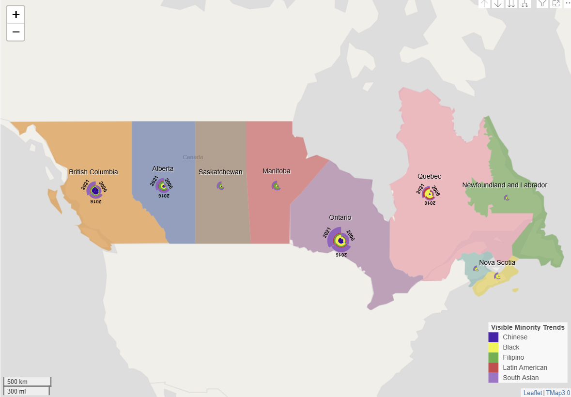
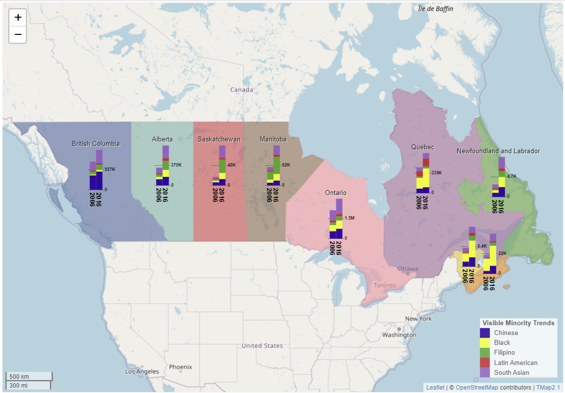
Cluster Symbols by the Polygon Layer
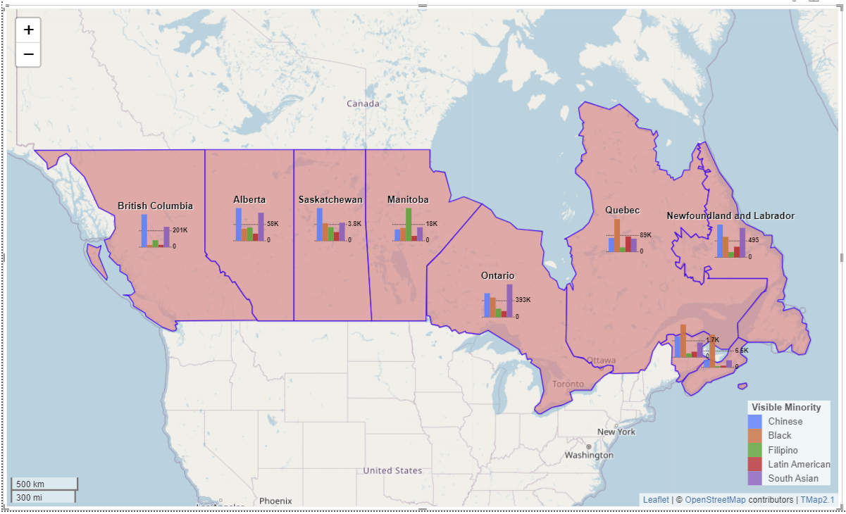
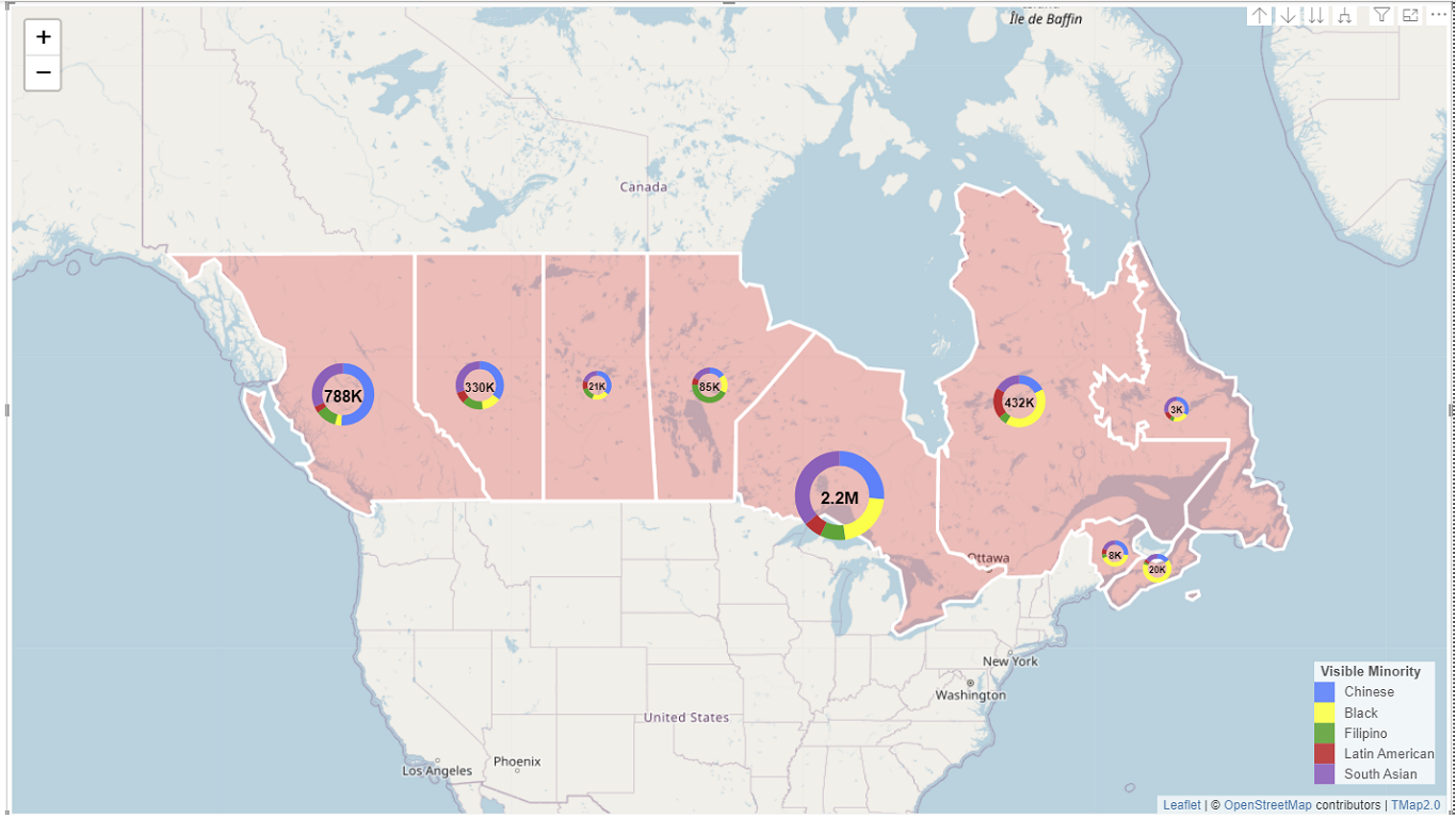
Drag a data column or multipe data columns to the "Size" bucket in the build visual pane, change the Longitude/Latitude fields to the aggregation "Average" or leave them empty, circle symbols or pie charts will be clustered by the polygon layer.
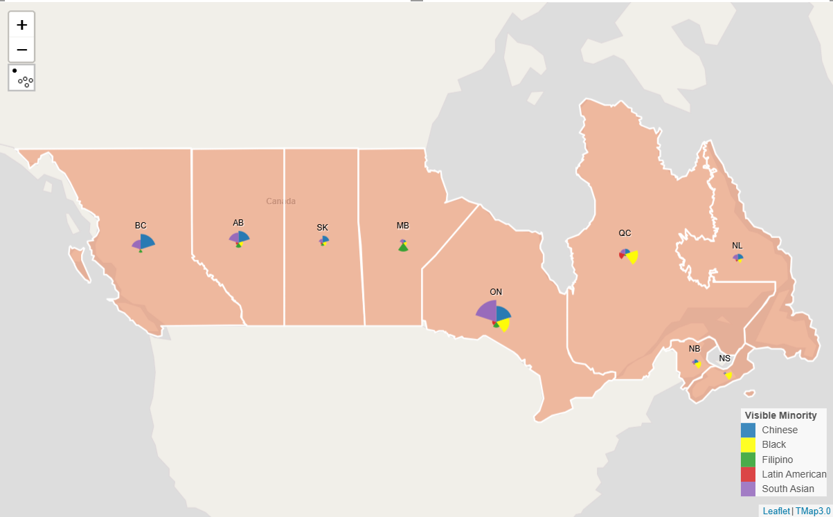
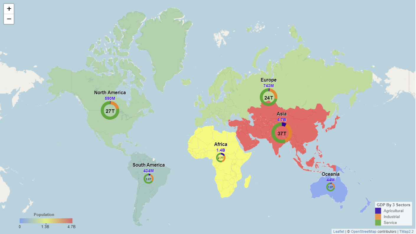
The following map shows pie chart of visible minorities for each census metropolitan area (CMA) in Canada before clustering:
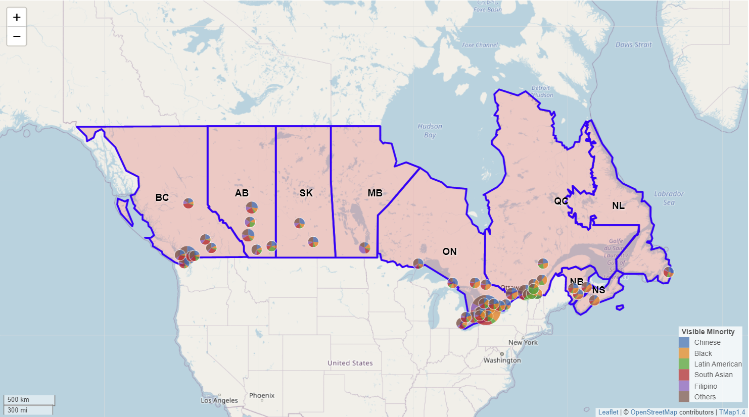
The following map shows pie chart of visible minorities for each province in Canada after clustering:
When the Longitude/Latitude fields are empty, symbols will be positioned by using the centre of polygons.
Drill Down Thematic Maps
1. Drill Down Donut Chart Map by Geonames
After having created a donut chart map, you can add a hierarchy of geographic names to the bucket "Label for Linked Layer" to drill down it. Before drilling down, please also check if metrics in the "Legend" or "Size" bucket are aggregated.
Please try it on the demo below by setting the drilldown mode and clicking a polygon.
Please note that you need to add geographic names in the order from the top level to the lower level. While drilling down by geographic names, the number of polygons is recommended to be less than 500 for the best performance.
2. Drill Down Donut Chart Map by WKT Layers
After having created a donut chart map, you can add a hierarchy of WKT polygon layers to the bucket "WKT for Linked Layer" to drill down it.
Please try it on the demo below by setting the drilldown mode and clicking a polygon.
Please note that you need to add WKT polygon layers in the order from the top level to the lower level.
3. Drill Down Choropleth Map by Geonames
After having created a choropleth map, you can add a hierarchy of geographic names to the bucket "Label for Linked Layer" to drill down it. Optionally you can add aggregated metrics values to the choropleth map by turning on "Label Amount" in the "Linked Polygon Layer" section of the format pane.
Please try it on the demo below by setting the drilldown mode and clicking a polygon.
Please note that you need to add geographic names in the order from the top level to the lower level. if calculated metrics such as GDP Per Capita are aggregated in drilling down, you need to use the role "Calculation" and the formula in the "Aggregation" section of the format pane.
4. Drill Down Choropleth Map by WKT Layers
After having created a choropleth map, you can add a hierarchy of WKT polygon layers to the bucket "WKT for Linked Layer" to drill down it.
Please try it on the demo below by setting the drilldown mode and clicking a polygon.
Please note that you need to add WKT polygon layers in the order from the top level to the lower level.
5. Drill Down Bar Chart Map by WKT Layers
After having created a bar chart map, you can add a hierarchy of WKT polygon layers to the bucket "WKT for Linked Layer" to drill down it.
Please try it on the demo below by setting the drilldown mode and clicking a polygon.
Please note that you need to add WKT polygon layers in the order from the top level to the lower level.
6. Drill Down Stacked Bar Chart Map by WKT Layers
After having created a stacked bar chart map, you can add a hierarchy of WKT polygon layers to the bucket "WKT for Linked Layer" to drill down it.
Please try it on the demo below by setting the drilldown mode and clicking a polygon.
Please note that you need to add WKT polygon layers in the order from the top level to the lower level.
Add Reference Layers
1. Upload shape/geojson file as a reference layer
Firstly, drag a column from Data Fields pane to the bucket "tooltips" or other buckets, secondly choose how many reference layers you want to add to the TMap visual from the section "Map Controls", then cards for reference layers will be added to the format pane. Under a reference card, click "Load Shape/GeoJSON File" in the file group, the following window will be shown on the map.
From the drop-in and upload window above, you can upload a shape file or GeoJSON file to TMap as a reference layer. After the file is uploaded, the title of reference card in the format pane will be changed to the file name of the uploaded file; then you can change the style for symbol, line and fill and set up visible zoom levels for the reference layer. Please note that the reference layer will be truncated to 8000 features for the performance reasons.
You can add 5 reference layers to TMap at most. The following is an example map including top symbol layer (population), linked polygon layer (wards) and 3 reference layers (main roads, parks and recreation facility study area, and air conditioned and cool spaces) for the City of Toronto, Canada.
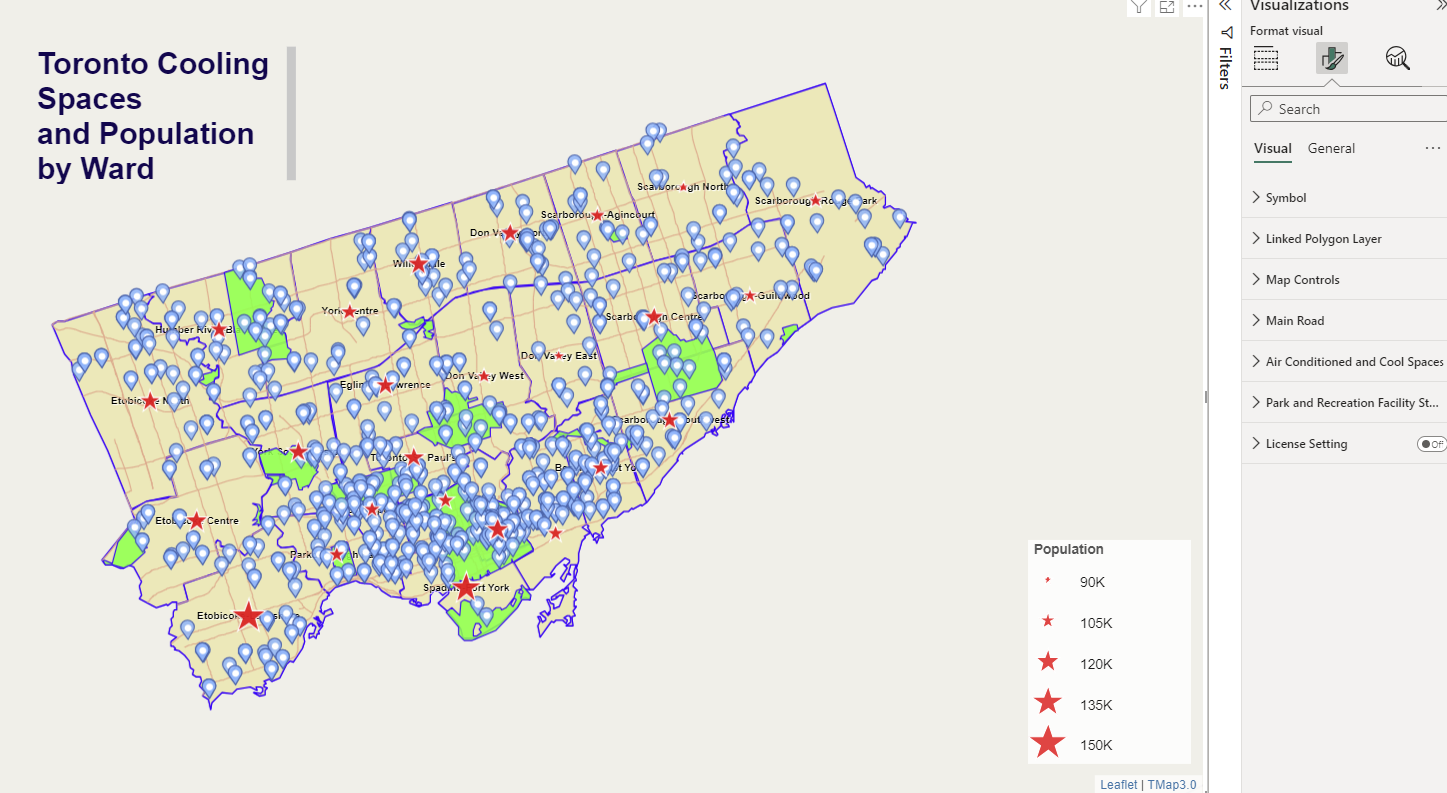
Labels can be added to reference layers. Turn on label in the reference layer section of the format pane, you can choose a field for labelling, change font, size and color for labels. The map shown below is an example for adding labels for the main road of Toronto.

2. Remove or replace a reference layer
If you want to remove or replace a reference layer from the TMap visual, just go to the reference card with the loaded file name in the format pane and click "Load Shape/GeoJSON File" in the file group, the following window will be shown on the map.
![]()
From the drop-in and upload window above, click the "Clear" button will remove the layer from the map. If you click the "Upload" botton or drop a shape/GeoJSON file to the drop-in area, the current reference layer will be replaced.
Outlier Analysis
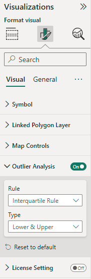
In the TMap Visual, You can conduct outlier analysis for proportional symbol map and symbol choropleth map. While turning on "Outlier Analysis" in the format pane, a rule and type for outlier analysis can be chosen as below:
After doing this, an icon for outlier analysis will be shown on the toolbar of the TMap Visual. you can click the icon to show outliers only (see below) or all points on the map alternately.
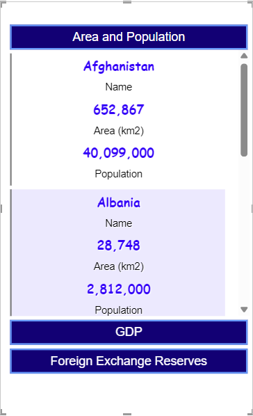
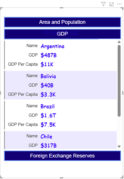
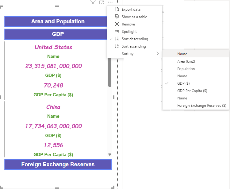
Multi-pane Card
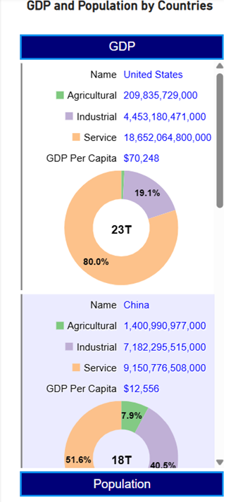
In the Multi-pane Card Visual, drag a few data columns to each "Card Pane" bucket in the build visual pane, a multi-pane card will be created as below:
In the "cards" section of the format pane, you can change the layout for label and value from "Vertical" to "Horizontal", then the card will be shown as following:
The user can select the direction and column to sort data from the more options menu, and top n rows will be shown:
If there are 2 or more numeric columns in the card pane, pie charts, donut charts or bar charts can be displayed by turning on "Chart for Pane i" in the format pane. You can change the chart type, set columns and change fill styles for the charts.
You can collapse and extend a pane by clicking a pane title. You can also customize text font, size and colors for pane titles, labels and values in the format pane.